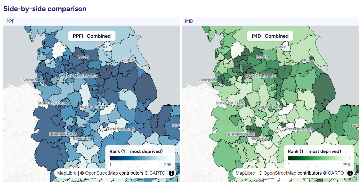
Two maps, two realities. This new tool helps you see where they align and where they do not.
Deprivation and food vulnerability do not always affect the same places. Two neighbourhoods can appear similar on paper, yet have very different everyday realities.
Our latest interactive tool, developed by Molly Sargent from Leeds Institute for Data Analytics, brings together the Priority Places for Food Index (PPFI) and the Index of Multiple Deprivation (IMD) to make those differences visible and easier to understand.
Why this matters
Living conditions vary widely across England, and policymakers and practitioners often rely on indices to identify areas of need.
The Index of Multiple Deprivation provides a broad picture of disadvantage, capturing factors such as income, employment and education. In contrast, the Priority Places for Food Index focuses specifically on food-related vulnerability, including access to affordable food and essential services.
While both are widely used, they measure different dimensions of need, and they do not always highlight the same places.
As newer metrics like the Priority Places for Food Index gain traction in policy and research, there is a growing need for tools that allow for clear and systematic comparison.
What the tool does
This interactive dashboard enables users to explore and compare patterns of deprivation and food vulnerability across all 32,844 neighbourhoods in England.
Key features include:
- Interactive choropleth maps at both neighbourhood and local authority level
- The ability to view each index independently or compare them side by side
- A “differences explorer” to highlight where and why the indices diverge
- Clickable areas for deeper local insights
- Data filtering and export functionality
Each index draws on seven themes, such as food access and transport, and is combined to provide both local and national perspectives.
Making complex data accessible
The tool has been developed in Python with a strong focus on usability and interpretability.
It offers:
- Clear, scale-appropriate visualisations at neighbourhood and local authority levels
- An accessible interface for users without specialist data skills
- Practical insights to support decision-making about where to target interventions
As Hannah Skeggs, Senior Health and Sustainable Diets Manager at IGD, explains:
“To improve public health, we have to understand the real-world barriers that stop people from accessing healthy, affordable food. The IMD-PPFI Explorer is a game-changer because it takes complex data and turns it into a practical tool for the food industry and policymakers. By building this robust evidence base, we can target support more effectively and drive the large-scale shift toward healthy and sustainable diets that we all want to see.
This research provides the vital evidence and insight we need to ensure that major policies, like the HFSS legislation, are working fairly for every community.”
What the data shows
The comparison reveals important differences between the two indices:
- 3,516 neighbourhoods fall within the top 20% of highest priority areas for both measures
- However, around half of high-priority areas differ depending on which index is used
This means that relying on a single measure risks overlooking important forms of need.
The same area, a completely different story
In some places, these differences are particularly striking.
For example, Druridge Bay ranks within the top 10% for food vulnerability according to the PPFI, yet it would not be identified as a priority area using general deprivation measures alone.
This highlights a key message: the index you choose shapes the story you see.
Why it matters for policy and practice
- Food-related need can be hidden within broader deprivation rankings
- Comparing indices provides a more nuanced understanding of local conditions
- This tool makes that comparison straightforward and accessible
- It offers practical value for decision-makers at every level
By bringing these two perspectives together, the explorer helps ensure that resources and interventions are directed where they are most needed.
Funding
Molly completed this project as part of Data Scientist Development Programme at Leeds Institute for Data Analytics. Project team: Molly Sargent, Emma Wilkins, Victoria Jenneson, Alexandra Johnstone, Michelle Morris, Alice Kininmonth.
The work was funded through the Transforming the UK Food System for Healthy People and a Healthy Environment SPF Programme, delivered by UKRI, in partnership with the Global Food Security Programme, BBSRC, ESRC, MRC, NERC, Defra, DHSC, OHID, Innovate UK and FSA. Grant award BB/W018021/1, with additional support from IGD (the Institute of Grocery Distribution) through their Social Impact programmes on healthy and sustainable diets. The FIO Food (Food Insecurity in people living with Obesity) and DIO Food additional funding stream (Diet and Health Inequalities); these projects comprise 7 work packages, delivered by the partner institutions within the consortium.